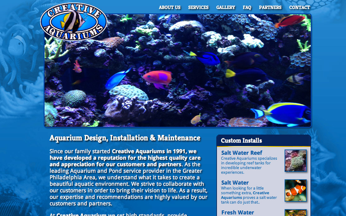
The original site for Creative Aquariums was way to busy, and had a store front they didn’t use. I took the site and scaled it back, it is more of a web brochure now. This allowed me to give the site a better visual direction while giving users just the info they needed.

